Exposing for the Black and White Infrared Landscape Image
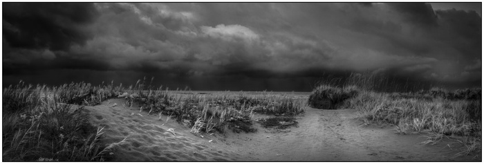
Fig. 1
Right out of the gate, let me start by saying that art, this includes infrared photography, is subjective. It is subject to the feelings the scene evokes within the photographer capturing the image. The final image is then subject to the emotion received visually by the viewer.
The capture of the image is affected by many things, but primarily it is influenced by the life and experiences of the photographer. I have a deep passion for black and white photography combined with a respect for the outdoors – our wild spaces. An additional influence upon my landscape work are the photographs of Ansel Adams. Each exudes an emotion subjective to how I read it. To me, that is what is so timeless about black and white done properly. After almost 50 years of having a camera in my hands, 36 as a professional – I am still a student of the art, learning daily in the field.
In the field, however, I, as a photographer, must begin my work in the objectively with an unbiased view of the scene in front of me – what do I see, what do I feel (physically) – this could be wind, heat, humidity or even cold. Closing my eyes, what do I hear. All of these objective observations will have a role in how I capture the scene into a subjective piece of art based upon my own internal reaction to external factors. You see, the objective observations help form a subjective opinion. Failure to translate properly or accurately between them and my image will fail.
I have had the opportunity to speak with viewer’s after seeing my art, the term “I see” is often spoken to communicate they have an understanding of the image or that they can “feel” what I felt at the instant of capture.
I, myself, am intrigued by how the human mind works with regards to photographs. We observe them most often in the direction of how our language is read. Our attention is grabbed by the differences in contrast, focusing and texture. The mind can be directed through a photograph by the contrast from light to dark. We also perceive flat images as being “real”. But, if I were to show my dog a photograph of another dog, she will have no reaction to it other than a sniff to say what is that? I do not know how many species this works with, but I feel this may be a unique trait for humans. This means, that subconsciously at least, we see meaning in photographs rather than just information. We are probably seeking meaning in everything around us as a secondary function of our brains. This, at least, is my observation and hypothesis. I may be totally off base, but it validates my experience with people seeing my work – especially when they say “it speaks to me”.
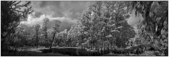
Fig. 2
So, what about my work in infrared speaks to people? I believe that the answer lies in a common question my infrared students ask – “how do I get the exposure to look like yours?”. My introduction to photography came in the film days. I like to think they are the not so recent past. This is also when I got my introduction to infrared film. Frankly, digital imaging has made infrared so much easier.
The answer to the question lies in my exposure I have found upon digging deeper into the source of the question. There is a visual language to light and thus exposure is the tool used to translate. First, it is imperative that we understand that in film photography my exposures were based on readings for the shadows or middle toned areas of the scene. I would generally expose for the middle-toned area but weighted for the shadowed portion of the scene – that was an attribute of film based on how it reacted to light. In digital imaging, the opposite holds true. I still use the middle-toned area, but now expose more for the highlights or brighter areas. Again, this is an attribute of the digital process.
In digital infrared imaging, the same exposing for the highlights holds true but with a slight twist. Infrared light is reflected light and it reflects differently than it does in film or digital photography.
In my own infrared work, I expose solely for the highlights knowing that I can “rescue” the shadows to a point by applying post processing techniques to the image. My own self restriction allows me to use only tools from the darkroom available in digital processing today.
The human eye is not able to see in the infrared spectrum, therefore our perception of what highlights and shadows are is only applicable to the non-infrared spectrum. This between about 430 and 700 nm. My own imaging is completed at the 720 and higher light spectrum. The best way I can explain is: if we cannot see it, then we are forced to see it in our mind’s eye – just as though we would in black and white imaging – we do not see the world in monochrome, we see it in color. Black and white is abstract for our brains to comprehend. Infrared is exactly that - abstract for our brains to comprehend.
Knowing that in digital imaging it is better to expose for the brighter portion of the image – highlights. We must understand how that is different in infrared vs. the visible spectrum. Highlights can be viewed as the items reflecting infrared and shadows as those absorbing infrared.
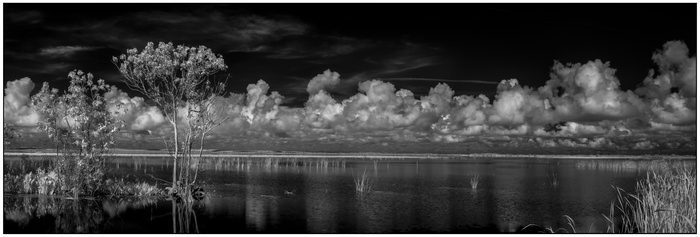
Fig. 3
In the image above (Figure 3) , captured at lake Apopka in Orange County, Florida, I knew that the grass in the lower right of the image and the foliage on the tree and small island would render as near white in the final image due to the fact that they use the photosynthethic process and reflect infrared making them the highlight in your image. Any leaf or plant that is green will render as white or near white due to this. Lighter green leaves will be a brighter white with the darker leaves being a more “near white”.
Lake Apopka is a large lake here in Central Florida and it is the headwaters of Florida Everglades. Using the panoramic format and the long line of low clouds, I was able to express the size of the lake and the flat terrain to this place I call home.
In this case, I was using a camera converted to 830nm to build the panoramic image and I found that an exposure of ISO 100, 1/40 at f20 worked best. As a general rule, I have found that being about 1.5 stops under exposed is a good starting point. Making test shots to reaffirm this is the next general rule.
Making my exposure for the highlights also allowed for the items absorbing infrared light (water and sky) to render as a rich black.
The lead image to this blog post (Figure 1), captured at Jetty Park, Brevard County, Florida, was exposed in the same manner and again with a camera converted to 830nm to build the panoramic image. I was teaching a class on the beach and had arrived a little earlier than everyone else. My drive to the beach had been in the rain. The dark wet look to the sand along these well-worn paths and the sound of the distant thunder came to be integral parts of this image. The beach grass would have still rendered white even without the bright sun as the storm cleared and went offshore. This again dictated that the object having a photosynthetic process be my exposure point. I metered the overall scene and underexposed by 1.5 stops. In the final image, I opened up about a half stop and exposed at ISO 100, f28 at .4 seconds.
In the second image of this post (Figure 2), the Palatlakaha River in Lake County, Florida, was exposed in the same manner. My intent to this image was to express a bit of cold in the air. Winter here in Central Florida may only require a sweatshirt or windbreaker – but there have been some nights with freezing temperatures. I remember snowstorms as a kid growing up in New England and the trees covered in snow. To express a chill in the air, I purposely over-exposed the trees. This enhanced the image and added a “chill” to the final print. My ending exposure was ISO 100, f8 at 1/125.
In each of the example images I have also included a border on the finished print. Everyone will have their own opinion, but they all boil down to an opinion of whether they either detract or add to an image. I am in the school of having borders on my work – my canvas work does not wrap around the frame - I include a black border to do just that. In today’s world, images are displayed electronically – TV, computer screens, digital frames and so forth. The use of a border defines the edges of the prints and in the case of black and white photography, it prevents image bleed onto the background.
Psychologically, this border sends a message to the viewer – they are now entering a different world and it aids in visual perception of the scene. It forces the viewer to change their perception of the scene. This is a vital part of how we react to the world around us. The border directs the viewer stay within these confines and experience what is here – don’t wander and be distracted.
The border also aids me in addressing two types of viewer – the first is the one who will look at the image and understand the meaning straight away. The second viewer may be less likely to see the meaning immediately – the border helps them focus and helps them experience the scene more readily.
In my infrared work, I utilize both converted cameras (720nm and 830nm) as well as a non-converted camera with a Singh-Ray IRay 690nm or Singh-Ray IRay 830nm . The choice of filtered or converted camera is dictated by the visual communication I am trying to give the viewer.
Converted cameras afford me faster shutter speeds, where the filters on non converted cameras bring the exposure to 30 seconds and longer in the middle of the day. Both of these considerations have a dramatic impact on viewer.
